Project Objective
How might we redesign the onboarding flow for premium feature to:
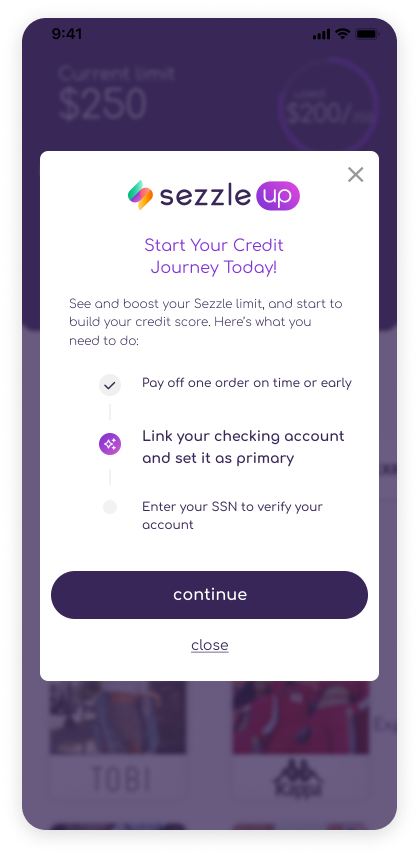
Clear demonstration and guidance of how to get eligibility for the program
Minimize steps needed to join the program
Attract more users to the program
Promote company mission of financial empowerment by helping users build credit
Problem Addressed - The Before
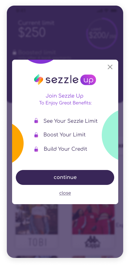
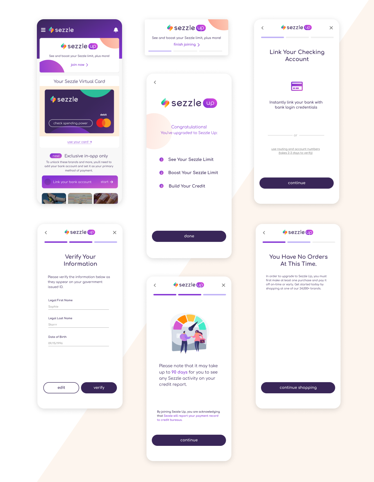
.png)
When I joined the team, we had just launched the MVP version. It is a good start for our program, and based on the customer feedback and analytics we got from FullStory, I identified some key problems for this redesign.
A big percentage of people drop out of the flow on the first step.
Assumption:
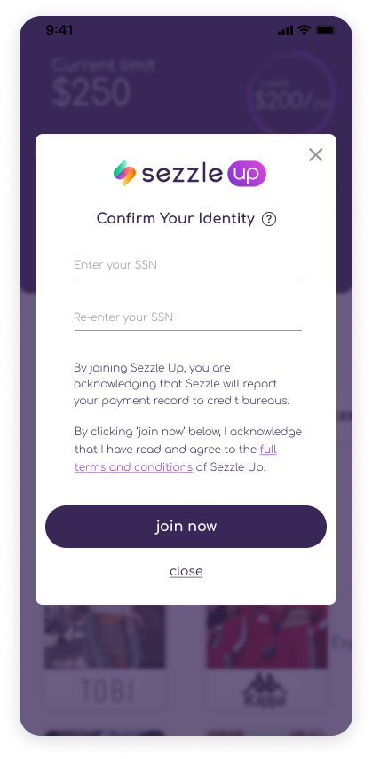
We currently ask the users to complete the hardest task first (verify their SSN), users are not quite comfortable with the step. And the benefits were not clear to users.Users don’t come back to the flow that much once they fail the first time.Assumption:
It wasn’t clear if we would save their progress, since they will see the same landing screen when they enter from the banner again.Users try to tap on disabled button and features list instead of the CTA.
Assumption:
Premium features list looks like buttons
CTA is not in a consistent place through the flow. V
isual noise: current color contrast is too vibrant for just showing progress and is competing with the CTA button.
Low completion of the onboarding flow even after they have completed 2 steps.
Assumption:
When a user doesn’t have an active order, the current flow would direct them to the blank order page. Many users go back to re-enter the flow to find out what needs to be done, others just give up signing up.
Process
After joining the project, I talked to different stakeholders including product manager, marketing team, data analyst etc. The deeper I got into it, the more I realized there were some constraints around my approach. Knowing the constraints, I made the first round of iterations.
Improvements
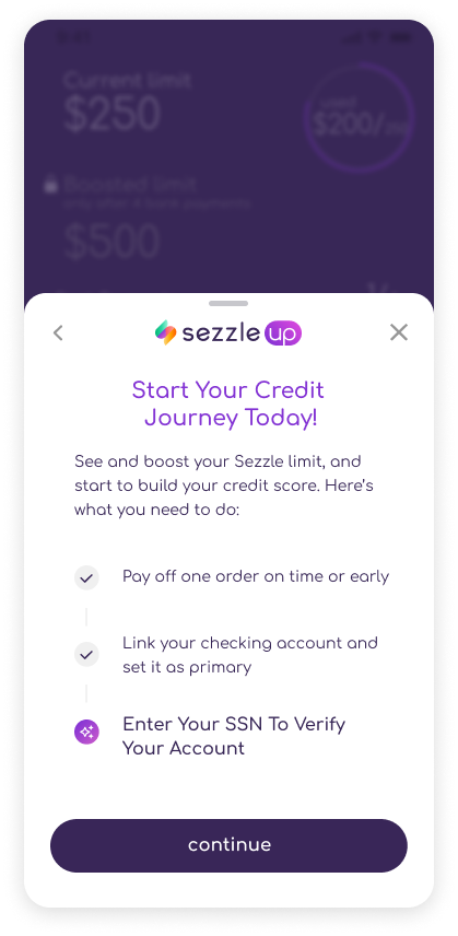
Consistency in task guidance.
The users are now focused on important messages on the screen and are clear about where to click to continue.
Continuity in experience.
The users will have clear guidance on how to complete tasks instead of being left on a blank page when they are not yet qualified.
Reduced visual noise, clearer typography hierarchy
When there is too much information needed on one screen, I either split them into different screens or create more contrast to highlight the more important messages to get the users focused on the task.
Testing
After I made adjustment to my initial design based on feedback from different stakeholders, I conducted 5 usability testings with existing users on this iteration. The result came back great. People found the process easy and smooth to go through. Here are some highlights I concluded:
User feedback
Some users were a little confused why the banner always ask them to ‘join
now’ even after they have begun the onboarding process. Since 2 of those tasks might not be something they can do instantly, they would be seeing the same banner for some time.
Accidental drop outs. We used a pop up modal for the original flow, but we discovered that some users accidentally clicked on the empty space and was dropped out of the flow. They then have to navigate back to the banner and go through the flow again.
Confusion around credit reporting policy. Some users expected Sezzle activity to show up on their credit report in a month, while it actually may take up to 90 days for us to report it. The confusion was raising some serious doubts in the product given that the ability to build their credit is the major incentive for some users to use our product.
Improvement
Added different status on the banner to draw users back to continue the process later. And this adds clarity to the fact that we save their progress.
Added the progress bar to give better feedback to users. Users will know exactly where they are in the process.We decided to promote the instant route to link their bank account because the manual one was leading to an increase in failure rate.
Added a single screen for credit reporting policy, and used visual elements to raise attention.
Changed the flow to full screen. I originally suggested the bottom drawer to allow more space, but as we eventually decided full screen is a more appropriate form for a more immersive experience.
Reflection
This was my first solo design project at Sezzle. I learnt a lot when communicating with other stakeholders. I learnt the importance of storytelling and articulating the design decisions to other people on the team. I appreciate how collaborative our team is and I enjoyed working together to implement these changes. As a new member to the team, there was a lot to learn. But I am glad we worked well and everyone was open to new voices and valued design.