Overview
The Tour feature is one of the core daily workflows for frontline employees such as security guards and janitors. They complete tours by visiting required checkpoints, performing tasks, and logging activities. These logs then feed into admin-side reporting and payroll. When I joined, the existing flow was difficult to navigate, unclear, and resulted in frequent user drop-off.
Stakeholders initially believed the problem could be solved with a visual refresh. However, early research showed the issue was deeper—a structural UX problem affecting task clarity and completion rates. I led the end-to-end redesign, including stakeholder alignment, user research, journey mapping, UI exploration, and usability validation. The result was a simplified, guided workflow that reduced confusion, minimized navigation layers, and improved task completion.This app is a workforce management software solution for managing Guarding, Cleaning and Facilities Services teams.
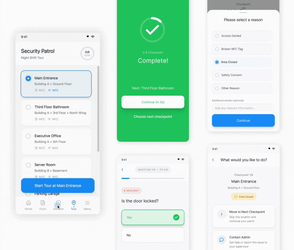
The goal for this particular flow is to guide users (e.g. security guards, janitors) to go on a patrol/ cleaning tour and complete required tasks on site. And the app will document their activities to report to the admin side to generate their work report and payroll.
My role
I was the sole designer on this project. I worked closely with our Product Manager, Engineer Teams, as well as Customer Success Team on this project. I was responsible for research, design and usability testing in this project, and being the advocate for best UX practice.
Research
When I joined this project, we already had an initial design and some research done. So I started by conducting interviews with internal stakeholders to learn more about initiatives.
I later found we had a pretty good understanding of admin users, but the missing part was understanding of the base employees who are our direct user for the mobile app. It was understandable because all of our other applications are focused on the admin users with little to no direct interaction with the base employee.
To validate the current design, I advocated for reaching out to end users and doing usability testing before launching MVP.

Initial testing
Participants: Internal: 6 (Conducted on site by my manager)
Current users: 6 (Conducted by me and PM online)

Problems
- Unclear actions: Users didn’t know what they needed to do for each step.
- No feedback loops: Uncertainty about what was documented created anxiety.
- Deep navigation layers: Too many screens for each checkpoint, causing disorientation.
- High effort & Drop-off: Too many taps to complete a tour, especially for users with dozens of checkpoints. Many users abandoned the flow because it's too complicated.
Revisiting User Flow
Based on insights, I reframed the journey map with the PM and proposed a shift from a “browse and select” model to a guided linear path.
Why?
Field employees typically follow a required route. Those who need flexibility could still browse—but shouldn’t be forced to. A linear model eliminates 2–3 unnecessary steps per checkpoint. Saving even 2 steps across dozens of checkpoints significantly reduces time and frustration.
Principles
To improve the current user flow, I led a workshop with stakeholders to revisit the user flow and came up with 3 design principles to guide the design:

Linear guidance — Always show the next required step.

Instant feedback — Ensure users know what was completed and recorded.

Clean navigation hierarchy — Reduce layers and eliminate unnecessary screens.
Explorations
Following the principles I came up with, and the journey map I worked on with our PM, I did some more exploration on the UI. After talking to our end users, I found that in most cases, users need to go on a tour in a specific order as required, but sometimes they have the flexibility to decide their own path. A few approches I tried:
- Seperating tasks, having only one action per step
- Getting rid of the check point list page all together
- Moving check point list to a secondary place


UI Refresh
I did a UI refresh for this project in 2025 as I was organizing my portfolio, a few major improvements I made:
-
Final Design
In the end we decided to go with an option that will cover all cases with consistency. A user can simply start a tour, click on the first checkpoint and be taken on a clear path. Or, they can stay on the list view to browse, or tap and go when they are on other sites. And by visually differentiating, users will clearly know the status of any checkpoint.


